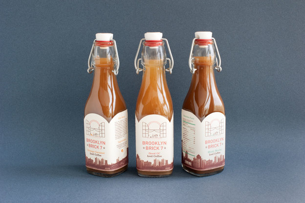
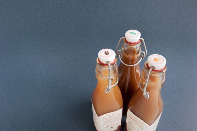
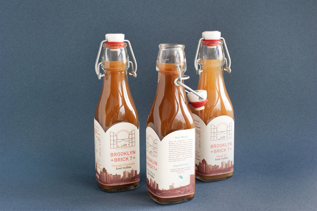
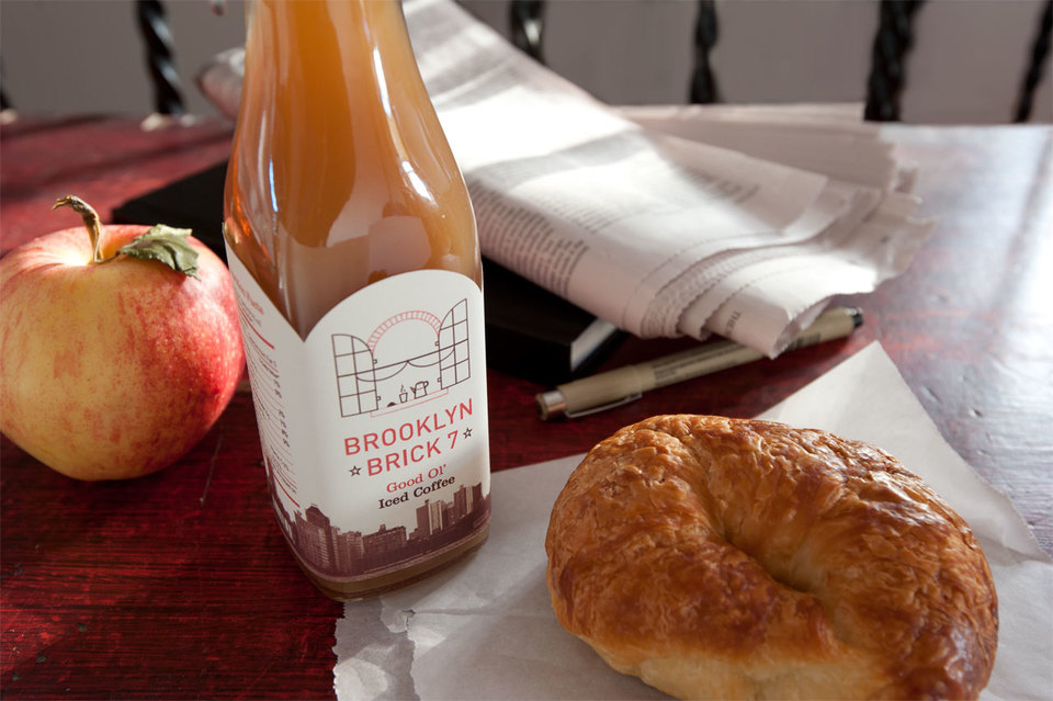
Influence was heavily drawn from Brooklyn to create a label design and identity concept for a new Brooklyn-based coffee company. The identity and label is for a line of iced coffee which would be initially sold in local stores. Looking to landmarks and history with a connection to coffee, the name Brooklyn Brick 7 comes from the historic Empire Stores Warehouse located along the waterfront in Dumbo, Brooklyn. It was once part of a bustling industrial community of roasted coffee operations of the 1860’s, including that of the Starbucks equivalent, brothers John and Charlie Arbuckle.

